Working at Glovo
Worldwide delivery service
I worked for the “back office” of Glovo, where all the product’s content exists and is created.
Sole product designer for 3 product teams, which meant a lot of stakeholder management.
Within these teams, I was the owner of the design cycle, from discovery, to design, assisting with research, alignment with development, and iterating.
I also worked with a User Researcher with whom we collaborated daily as one UX team.
At the same time, I was in constant alignment with the larger design organisation, for feedback and to improve my work.
Inside the Admin panel
The un-designable behemoth
The platform was an enormous Admin panel, used by +10 teams for different purposes.
In the Content team, we had a complex type of user: Agents - External contractors employed by Glovo for specific tasks, like data input.
Mostly, we dealt with small projects with high impact - a lot of value to be gained for both business and users.
There were also large and complex projects which meant a lot of discovery alongside developers and product managers.
There was no design system or design guidelines, the platform was initially “designed by developers”.
Who we were designing for the Agents
User’s context
They are contractors of Glovo, paid hourly and per outcome.
They get bonuses for accuracy (no errors) and amount of tasks done in 1 day (stores created).
They follow guides on how to accomplish their tasks.
Based in Spain, and South America
They use Google Translate for translations - most speak very basic English.
Possible focus areas
→ Task optimisation could lower times per task, and decrease business costs.
→ Platform fixes could improve their efficiency and ease of work.
→ Strong need for a more plain and easy to follow language, no lingo or non-translatable terms.
The project: Search Optimisation
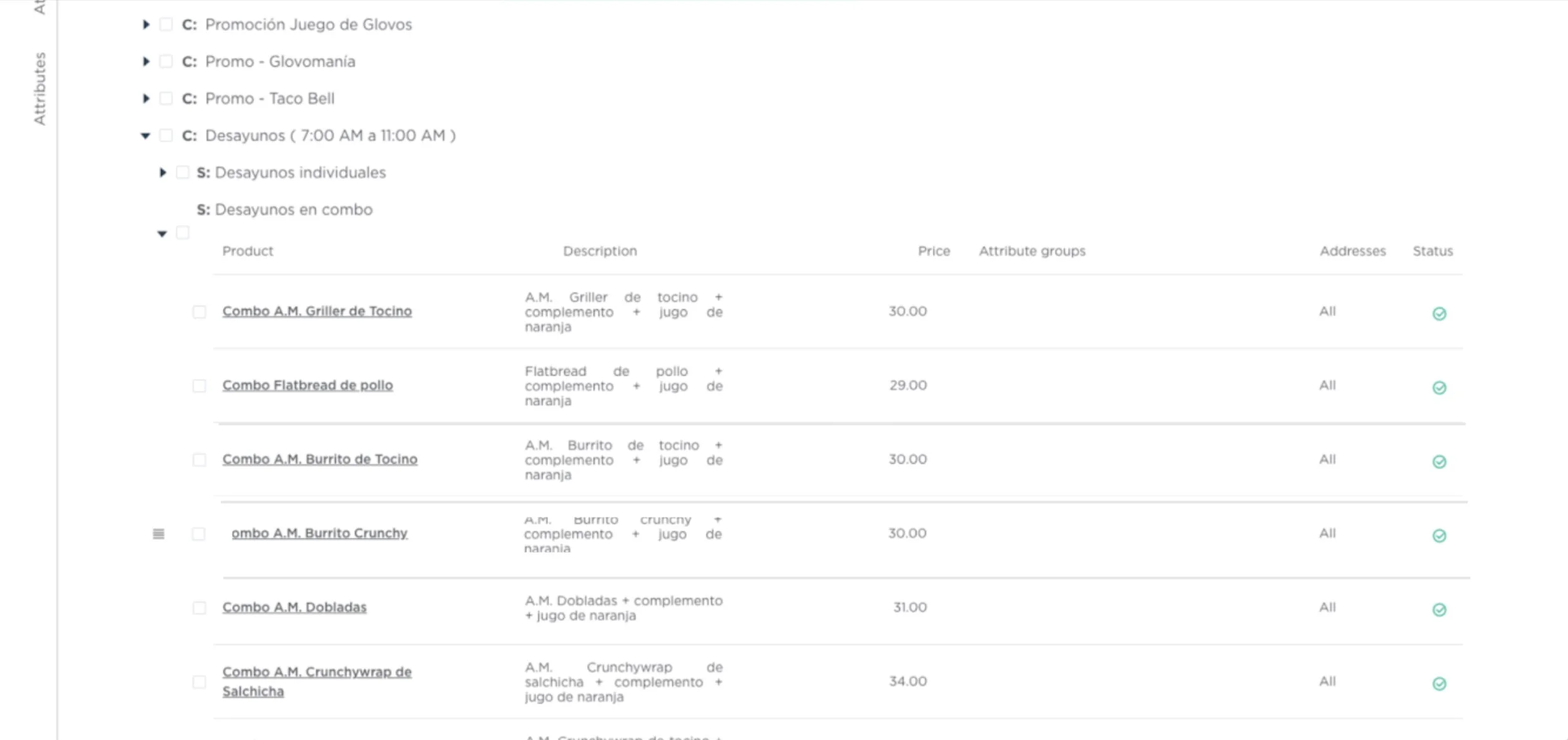
Note: Sadly, I don’t have a better quality view of this screen. The original design was quite similar to this one.
Project context
The search engine for the platform couldn’t handle large catalogues (10k+ products) due to rendering issues.
Loading times could reach 15 minutes. Users were negatively impacted; and…
The acquisition of massive partners was put on pause.
Expected business impact
Faster catalogue ingestion will mean bringing in bigger and better clients for Glovo - such as large retail stores, for example - with massive catalogues.
Also, agents would be able to perform their jobs more efficiently, reducing labour time/costs.
Why were these issues happening?
Understanding the state of the Search function
Unmoderated task tests with 8–10 Content Ops agents recorded tasks and a survey - via Maze.
The research aimed to know how, and why, agents used the search function, clarifying a lot of assumptions about them.
Focused on patterns, understanding their behaviour.
Undertook a heuristics analysis to assess the state of the Search function.
We tracked events via Datadog to measure platform use.
🚧 and after a lot of work… 🚧
…two rounds of iterations later, we have the MVP!
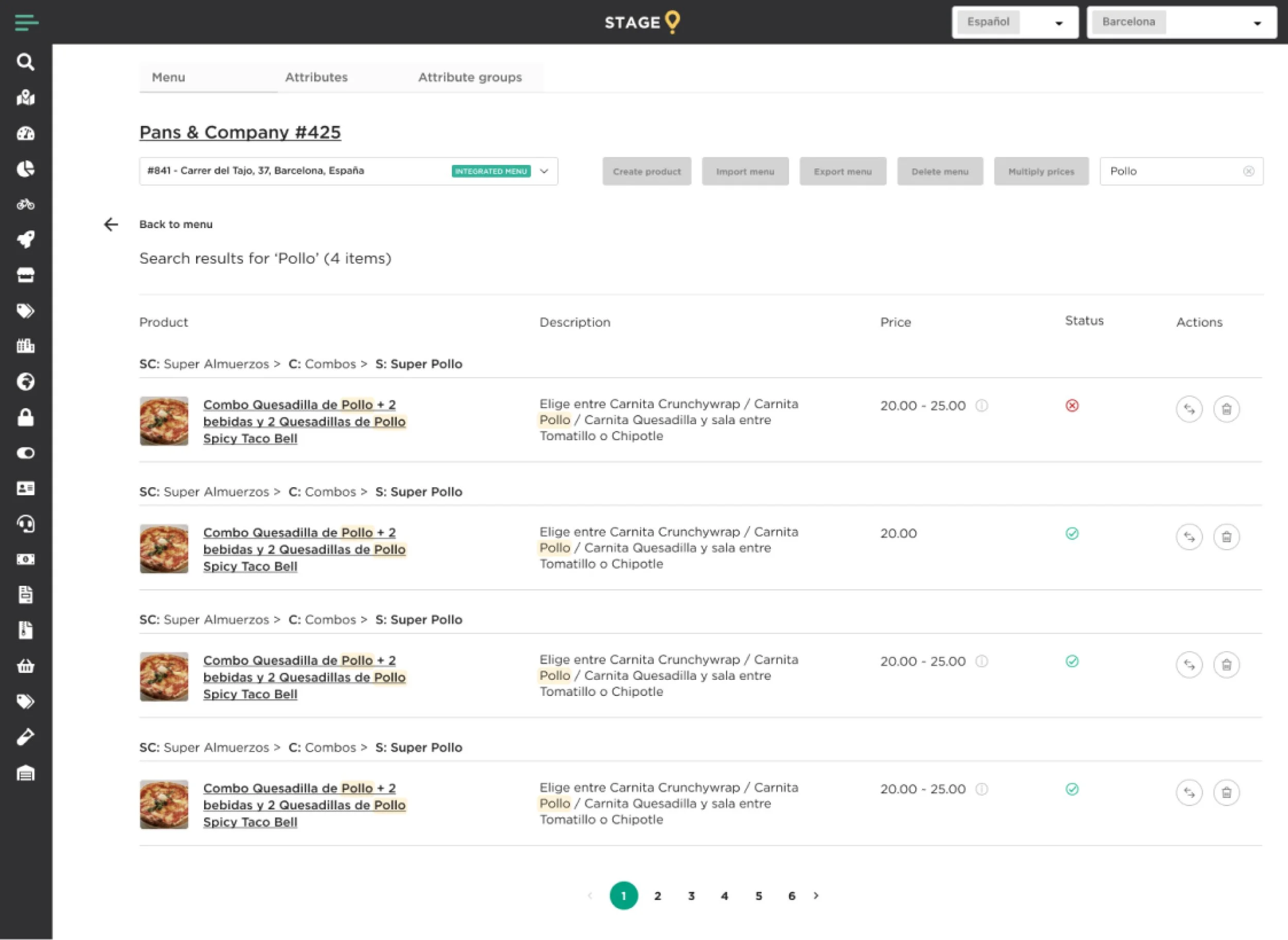
→ Updates due to research
Redesigned the view, so there’s more space for the relevant information.
The user only sees relevant columns of information, other fields are removed.
Search occurs also in the product’s description.
Updated buttons and pagination to follow Glovo’s design system.
Measurable impact on the user
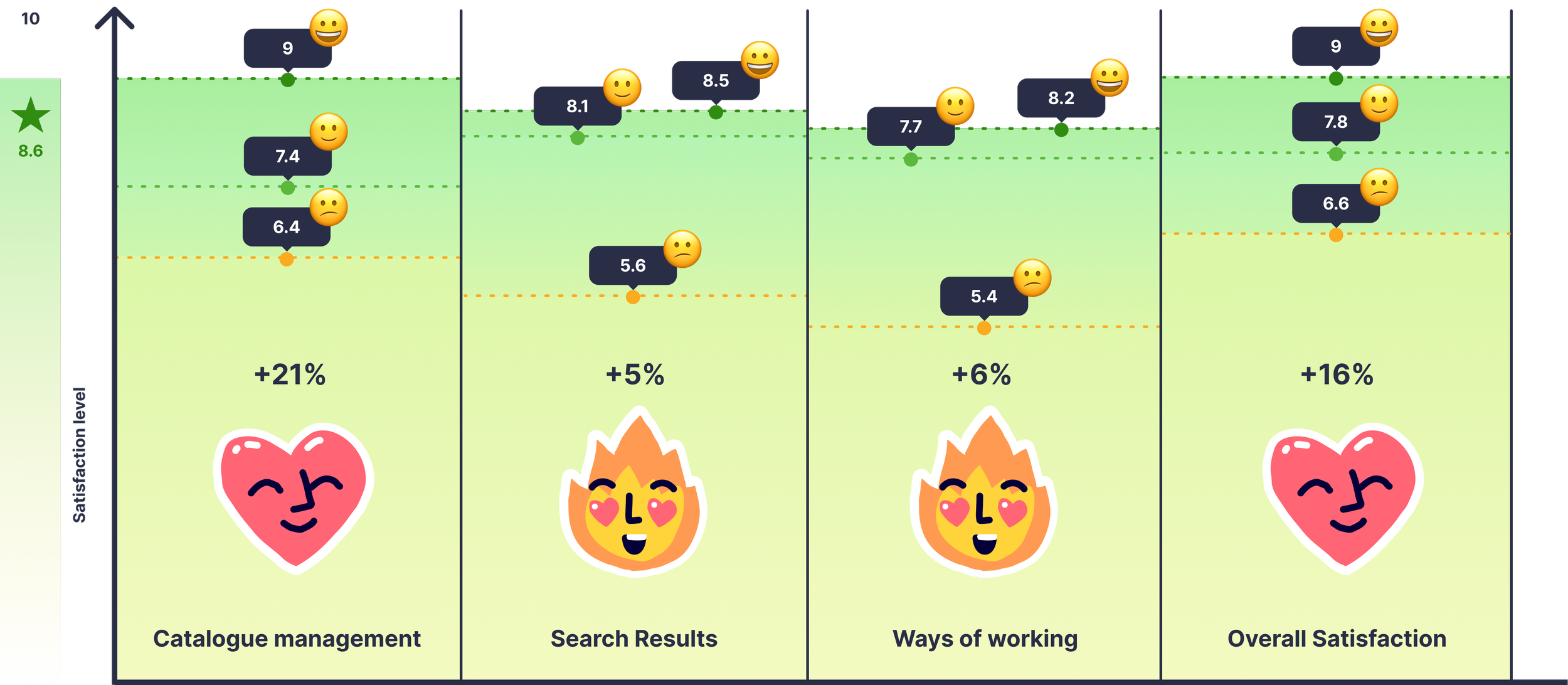
Here you can see how satisfaction rose with each iteration, measured by SUS after both betas. — measured via Maze surveys.
Did we generate business impact?
Loading time
15 min vs. 15 sec
Large and massive catalogues are now integrated, and business opportunities are unlocked.
→ 98% reduction in loading time
Product processing
2 min vs. 15 sec
Discoverability is almost instant, products quickly load, and match the user’s search intention.
→ Agent cost is reduced by 13%
Product fetching
60 sec vs. Milliseconds
Search is more efficient, products are easier to find and edit.
→ -3% order mismatches
And what about design systems?
The platform did not have a design system at this point. So, for new projects, we proactively brought in components from other design systems in the org.
I started the process of UX and UI auditing our section of the Admin panel in order to kick-start our own branch of the design system.
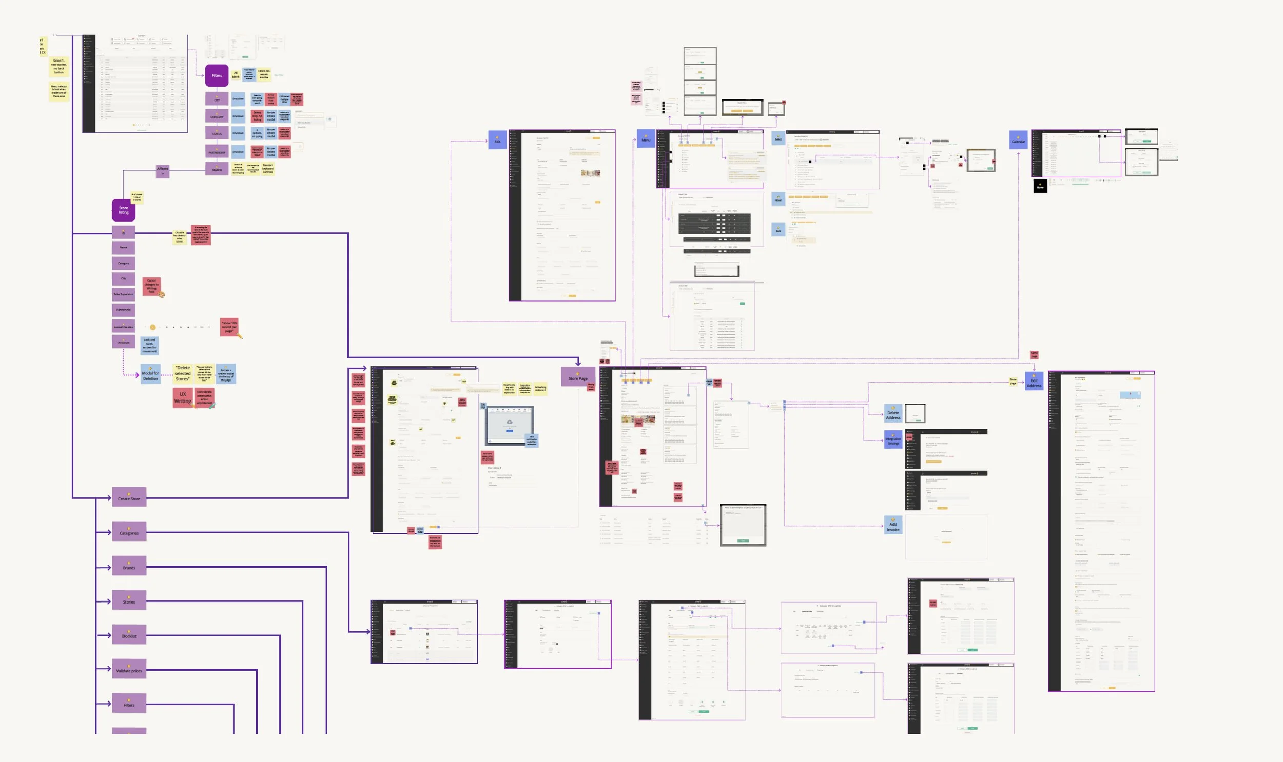
One section of an extensive Miro board for the UX and UI audit. I’m happy to show it in detail over a meeting.
It’s all about the learning
Cycle of design outcomes
Our ways of working and collaborating were established, and Stakeholders were very satisfied with the design and development process.
The team learned to leverage user’s needs vs. development needs.
…and what would I have done differently?
❗️The research was critical but took a lot of time to get the results. Perhaps by doing A/B testing we could have more quickly assessed the impact.
🖥️ Documentation could have been improved. At this point, all of it was very dev-based.
…and that is it!
Thank you for reading 💫
Wanna check other case studies?

Students were asking questions wrong, by design. We fixed the flow.

Users in India wanted video. We shipped audio. Here's why that was the right call.
