Working at Lastminute
Flights, hotels, and the occasional holiday of a lifetime
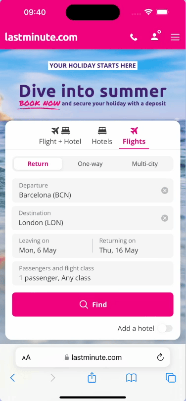
Lastminute.com is a B2C Online Travel Agency selling flights, hotels, and travel packages across multiple European markets.
I was the sole designer across two teams: Checkout and Payments — the flow after a user picks their trip, where they upgrade it and pay for it.
We worked on desktop and mobile web. The app was a separate team.
My trio: me, a PM, and a dev lead. UXR was separate but close.
The team had just come out of maintenance mode — which is a polite way of saying there was a backlog of debt and a lot of room to move.
My role in the team
Some context to start with
I owned design end-to-end across both Checkout and Payments, from discovery through to delivery.
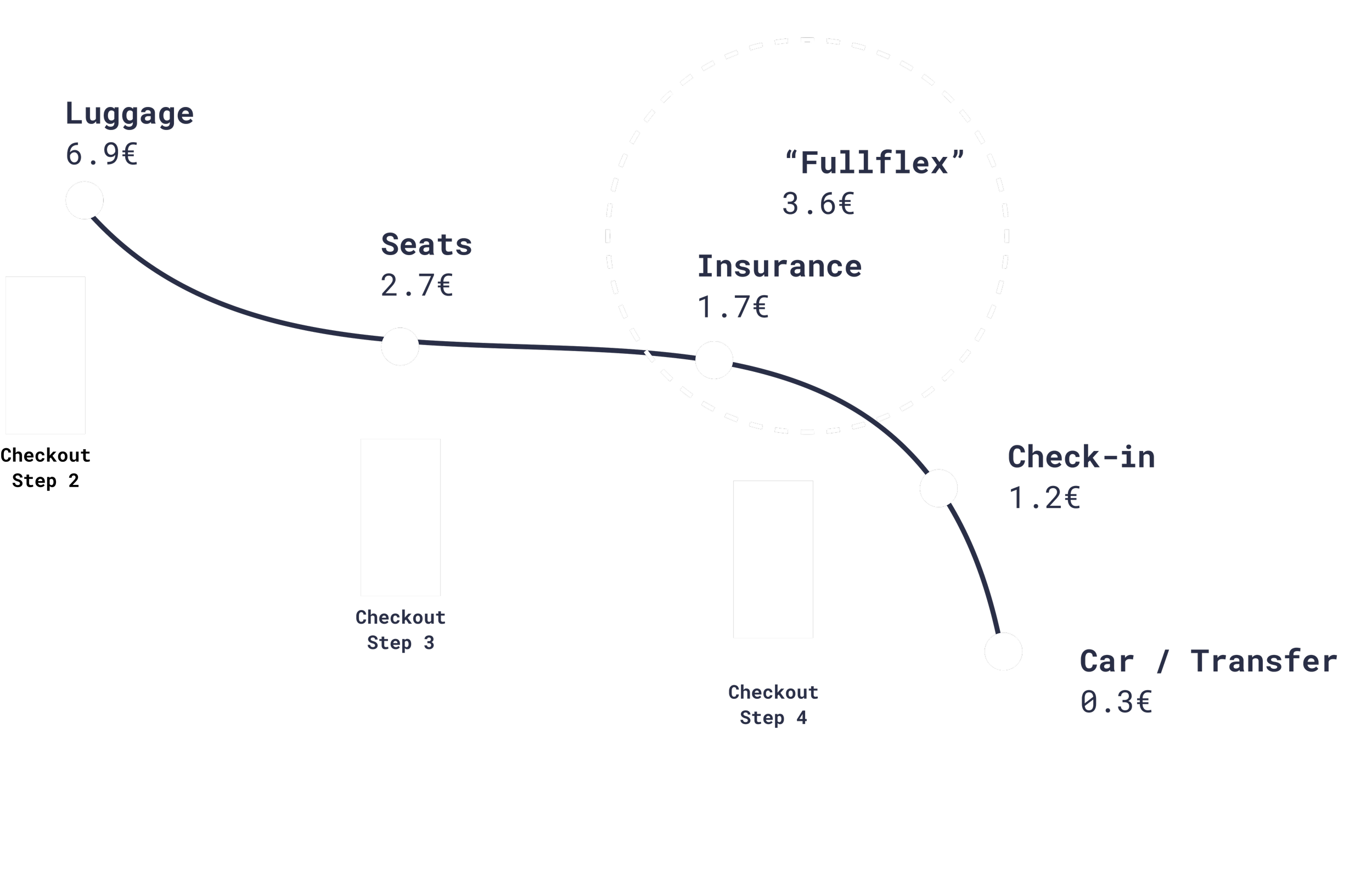
I worked with "ancillaries" — the additional products users can add to their trip: seats, luggage, insurance, and more.
I collaborated closely with UXR, UX Writing, dev leads, and stakeholders across markets.
One of my core tasks was auditing the tool and analysing usage with qualitative and quantitative info.
Our team began asking questions…
Not always solvable, but always we can put in effort to improve the experience as a whole!
Are users actually understanding what we're selling them?
Are we giving them the right tools to build the trip they want?
Are we setting them up for success, or just setting them up?
...from business side, these were our KPIs 👀
With any project, we needed to move improve three metrics, “move the needle” so to say.
ARS
Attach Rate on Shown: If a user sees a product, do they add it?
UR
Unitary Revenue: What's the monetary value of each ancillary added?
CR
Conversion Rate: Are users completing checkout?
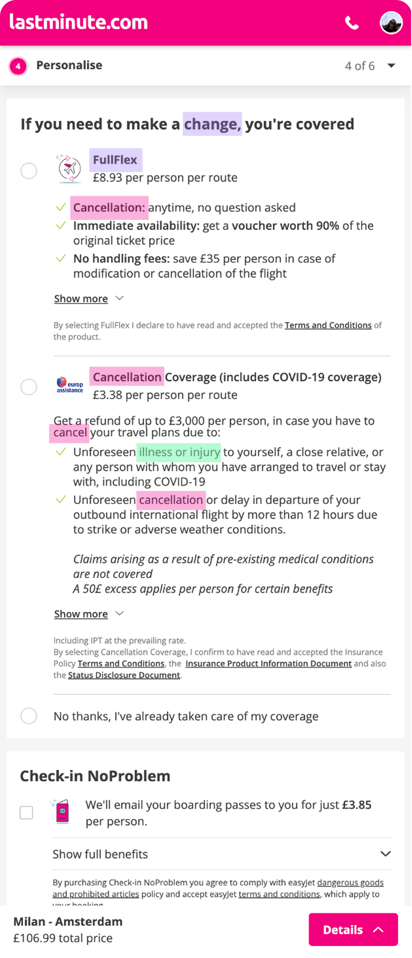
Let's talk about insurances (fun! 🎉)
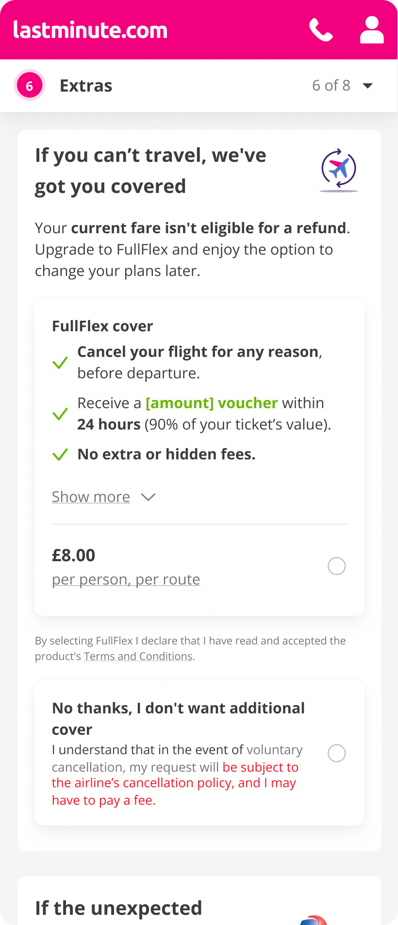
We sold two protection products that had a few... similarities.
FullFlex: cancellation flexibility. Cancel your flight, get a voucher.
Travel insurance: which also covered cancellations. And medical. And sometimes lost luggage, depending on the market.
Users could only pick one. Which meant users who wanted both, couldn't. And users who were confused, which was most of them, skipped both.
We also knew mobile CR and ARS were lower than desktop. So we had two problems for the price of one.
…but why insurances?
There were other projects in the pipeline for Luggage and Seats. “Insurances” had a lot of tech debt, and known issues.
User Research gave us great insights
One study with 10 participants, moderated interviews
From research we knew that users were at times confused with our services (ancillaries) and believed they were being sold the same thing multiple times.
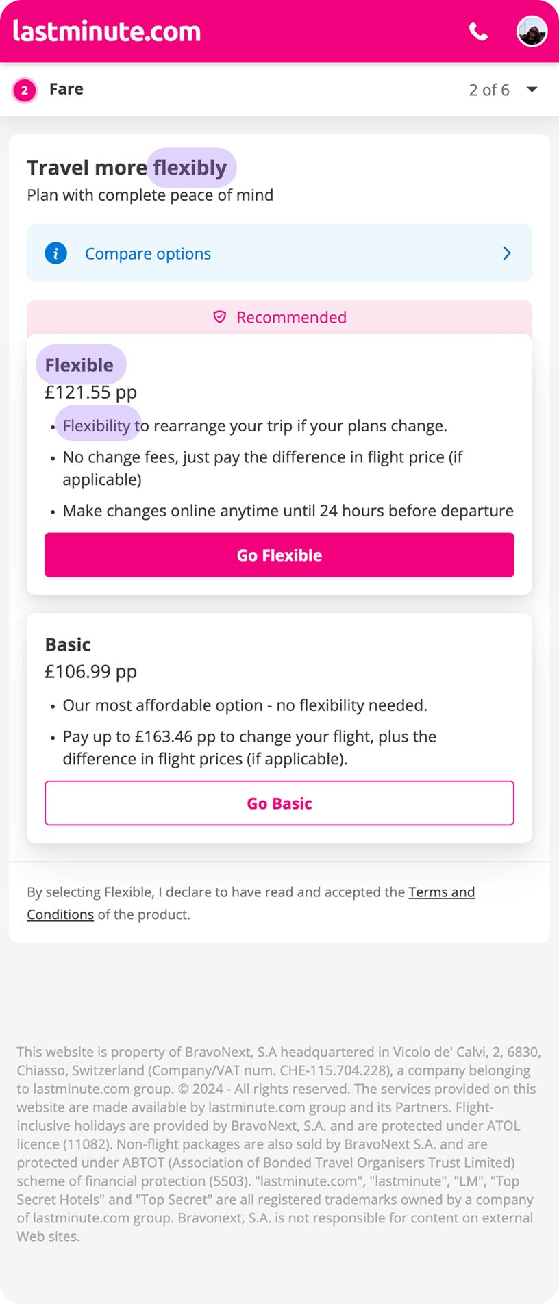
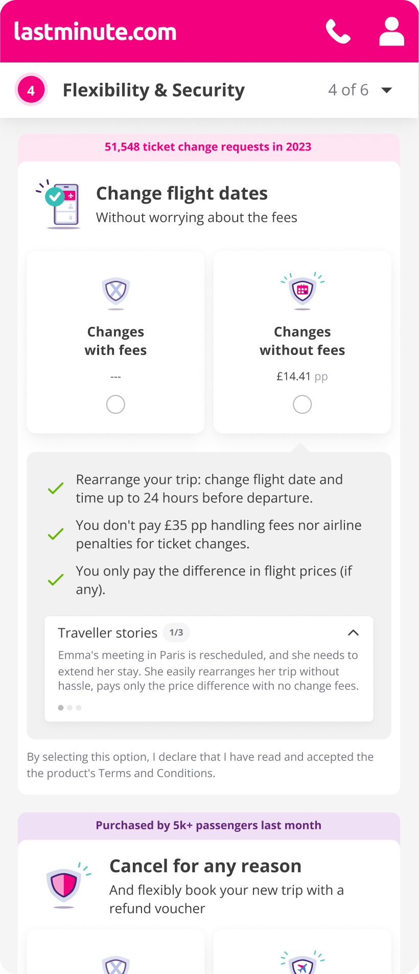
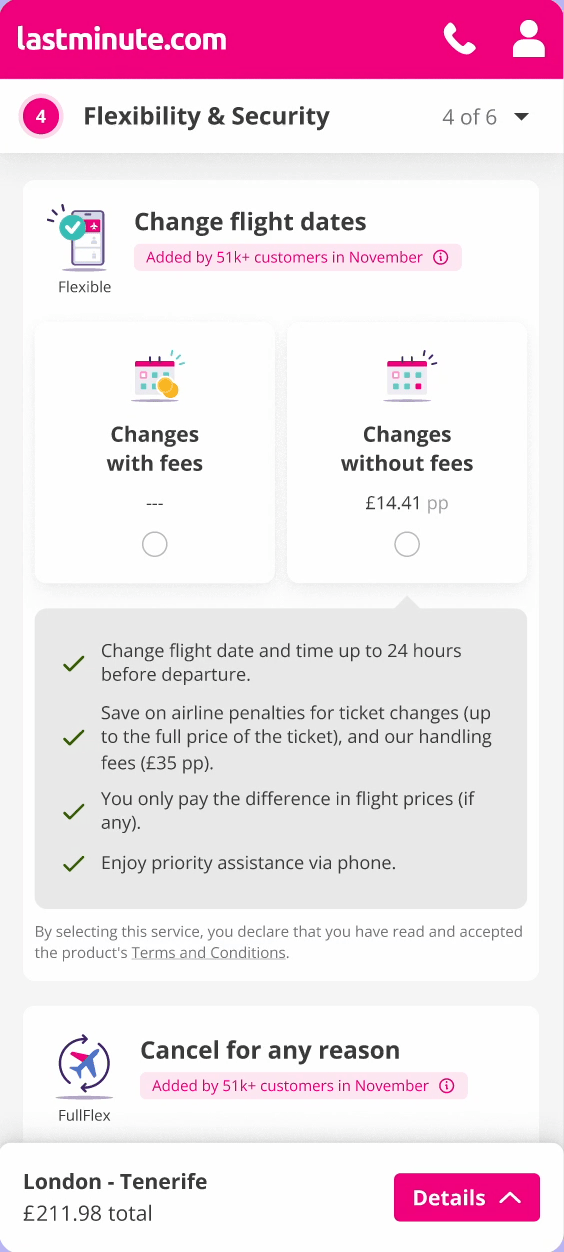
Particularly, due to its terminology users were confused between the Flexible Fare (seen here) our FullFlex service and our Insurance service (which also mentioned flexibility).
We also researched our markets and knew that each one had a perception of insurance (e.g in the UK they usually have annual insurance plans, so they don’t often buy insurance).
So… What’s the plan?
There was a lot what could be done, both for long and short term gains. We decided on a gradual approach to unlock the full potential of insurance services.
This is a simplification of the whole process, the logic was to always: build, test, measure.
Part 1 →
Decouple insurances as an MVP, align with the team and facilitate workshops
Part 2 →
Measure impact, plan and execute research with a design vision
Part 3
Launch final iteration, measure and iterate if needed
🚧 … after a lot of work… 🚧
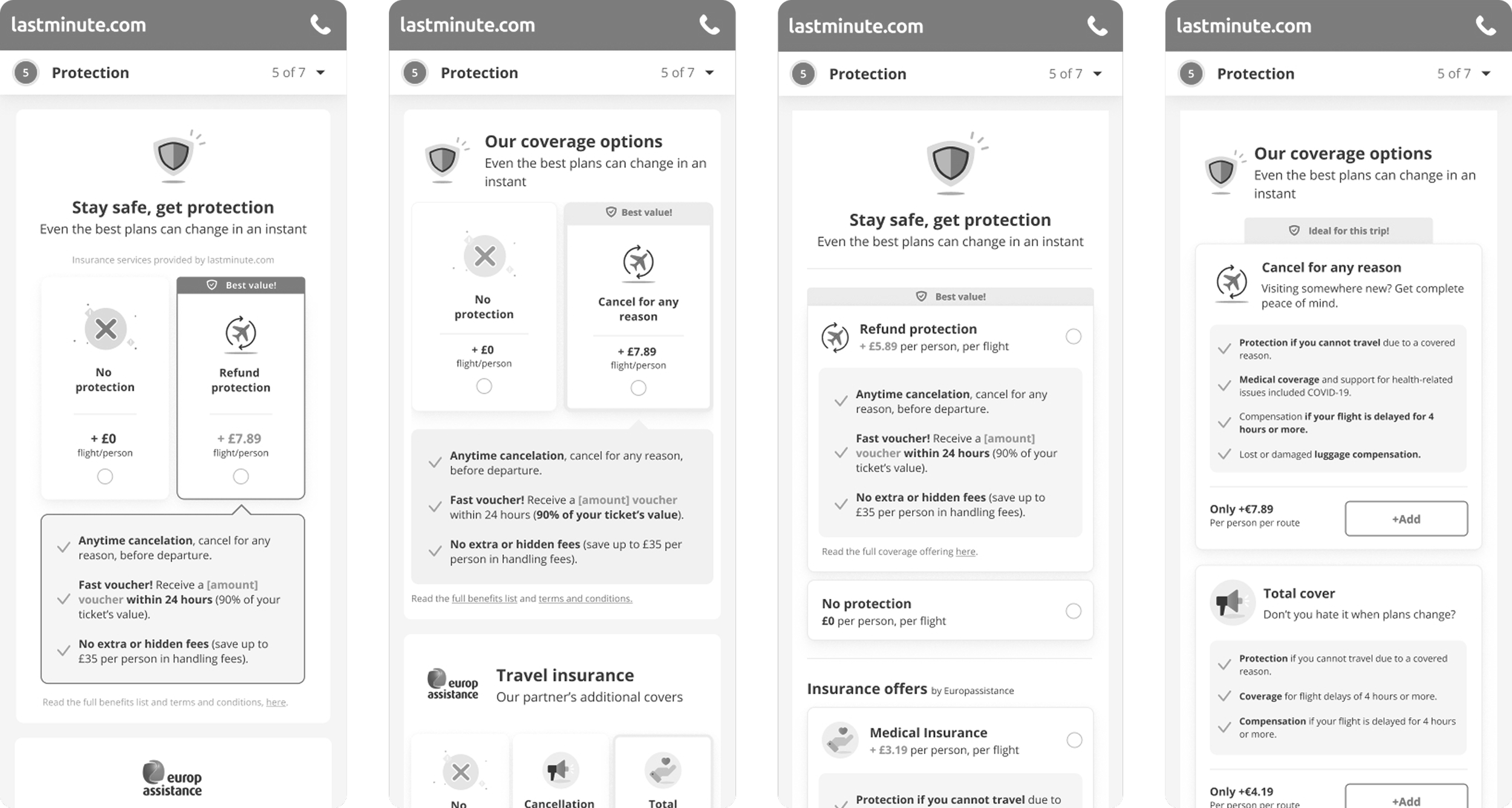
A sample of a few rounds design iterations to optimise the design vision
MVP: decouple insurances
Fix legacy issues and allow users to select insurances independently. Additionally, improve the copy for clarity.
At this stage the design din’t change much, it was about development, mostly.
→ First reactions:
We noticed that users were skipping this section. Were they not caring? or just avoiding reading?
Decided to add the YES/NO question as mandatory, lead to +200% ARS and +1€ of UR
Iteration 1: Big bets for mobile
Remember that the mobile version had lower CR? The design vision aimed to fix this.
We decided to optimise the flow, make it mobile first
Gave insurances its own page
Reduced cognitive load, reduce text when (legally) feasible
Added proof of success and examples to make it more relatable
Iteration 2: Final design
To simplify, the design evolved after research and measuring its impact
We unified the three services in one step (reducing a step for users).
We kept proof of concept (but improved the visuals).
Removed the traveller stories (they were detrimental).
We ensured colour accessibility compliance.
The copy was more direct and consistently differentiates our products.
What did the data say?
Let’s see if we managed to move the needle, from MVP to final iteration!
+5%
ARS (Attach Rate on Shown) increased on average
✅ Goal met!
+209%
UR (Unitary Revenue) for insurance services went from 5,3€ to 11,€
✅ Goal met!
+3,42%
CR (Conversion Rate), increased on average post launch
✅ Goal met!
…but not everything improved!
Things that we cannot change so easily
Mobile Conversion rate (CR) and Attach Rate on Shown (ARS) did not change
A common pattern is that people browse on mobile but then go into desktop to book trips, so it’s hard to move the needle on mobile when it differs from the user’s mental models.
Perhaps… we need to do something to make users feel safer on mobile? 🤔
Product cannibalisation 👹
As there are a lot of ancillaries (products you can add to your trip) and our insurance offering was very complete now, it made other products with a worse offering…suffer!
This made us re-analyse our offerings per markets and see where to show or hide certain products to avoid detriments and overlaps.
After ideation we started on a project of Insurance unification for certain markets where offering was not as extensive.
After all of this… what are my learnings?
A lot of research, a lot of collaboration, and a lot of insights!
Make the best of each iteration - perhaps some problems could have been tackled in iteration 1!
It’s better to do gradual changes to understand impact, in the second iteration we changed a lot at once.
There are some UX dark-ish patterns in travel that cannot be escaped from 😔
…and what would have I done differently?
❗️Plan how to maximise efforts to ensure faster results!
🖥️ Understand MVP as truly incremental value, even if it costs more time to get there.
…and that is it!
Thank you for reading 💫
Wanna check other case studies?

Enhancing users’ workflow and business revenue at the same time
